Styling
Overview
Reflex components can be styled using the full power of CSS.
有三种主要方法可以为您的应用程序添加样式,它们按以下顺序优先级排列:
- Inline 内联:应用于单个组件实例的样式。
- Component 组件:应用于特定类型组件的样式。
- Global 全局:应用于所有组件的样式。
Global Styles 全局样式
You can pass a style dictionary to your app to apply base styles to all components.
# 可以在此处给app设置默认字体系列和字体大小,而不必在每个组件上设置它
style = {
    "font_family": "Comic Sans MS",
    "font_size": "16px",
}

app = rx.App(style=style)
Component Styles 组件样式
在 style dict 中,还可以为特定 component 类型或任意的 CSS 类和 ID 指定默认样式。
style = {
    # Set the selection highlight color globally.
    "::selection": {
        "background_color": accent_color,
    },
    # Apply global css class styles.
    ".some-css-class": {
        "text_decoration": "underline",
    },
    # Apply global css id styles.
    "#special-input": {"width": "20vw"},
    # Apply styles to specific components.
    rx.text: {
        "font_family": "Comic Sans MS",
    },
    rx.divider: {
        "margin_bottom": "1em",
        "margin_top": "0.5em",
    },
    rx.heading: {
        "font_weight": "500",
    },
    rx.code: {
        "color": "green",
    },
}

app = rx.App(style=style)
Inline Styles 内联样式
内联样式适用于单个组件实例。它们作为常规属性传递给组件。
子组件继承内联样式,除非它们被自己的内联样式覆盖。
rx.text(
    "Hello World",
    background_image="linear-gradient(271.68deg, #EE756A 0.75%, #756AEE 88.52%)",
    background_clip="text",
    font_weight="bold",
    font_size="2em",
)
行内样式也可以通过 style 属性设置。这对于在多个组件之间重用样式非常有用。
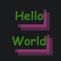
text_style = {
    "color": "green",
    "font_family": "Comic Sans MS",
    "font_size": "1.2em",
    "font_weight": "bold",
    "box_shadow": "rgba(240, 46, 170, 0.4) 5px 5px, rgba(240, 46, 170, 0.3) 10px 10px",
}

rx.vstack(
    rx.text("Hello", style=text_style),
    rx.text("World", style=text_style),
)
style dict 按照它们传入的顺序应用。这意味着后定义样式会覆盖前定义样式。
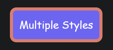
style1 = {
    "color": "green",
    "font_family": "Comic Sans MS",
    "border_radius": "10px",
    "background_color": "rgb(107,99,246)",
}
style2 = {
    "color": "white",
    "border": "5px solid #EE756A",
    "padding": "10px",
}

rx.box(
    "Multiple Styles",
    style=[style1, style2],
)
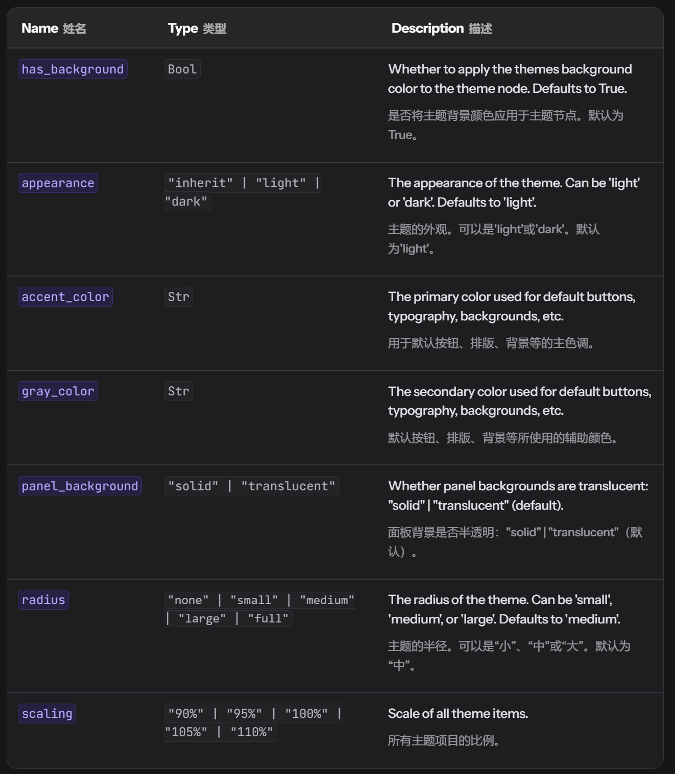
Theming 主题
The Theme component is used to change the theme of the application. The Theme can be set directly in your rx.App.
app = rx.App(
    theme=rx.theme(
        appearance="light",
        has_background=True,
        radius="large",
        accent_color="teal",
    )
)
Additionally you can modify the theme of your app through using the Theme Panel component which can be found in the Theme Panel docs.
==Tailwind==
Reflex supports Tailwind CSS out of the box. To enable it, pass in a dictionary for the tailwind argument of your rxconfig.py:
import reflex as rx


class AppConfig(rx.Config):
    pass


config = AppConfig(
    app_name="app",
    db_url="sqlite:///reflex.db",
    env=rx.Env.DEV,
    tailwind={},
)
所有 Tailwind 配置选项都受支持。插件和预设会自动包装在 require() 中:
config = AppConfig(
    app_name="app",
    db_url="sqlite:///reflex.db",
    env=rx.Env.DEV,
    tailwind={
        "theme": {
            "extend": {},
        },
        "plugins": ["@tailwindcss/typography"],
    },
)
You can use any of the utility classes under the class_name prop:
rx.box(
    "Hello World",
    class_name="text-4xl text-center text-blue-500",
)
若要临时禁用 tailwind,只需:
config = rx.Config(app_name="app", tailwind=None)
Special Styles 特殊样式
We support all of Chakra UI's pseudo styles.
rx.box(
    rx.text("Hover Me", _hover={"color": "red"}),
)
Theming
Theme component 用于修改 app 的主题。The Theme can be set directly in the rx.App.
app = rx.App(
    theme=rx.theme(
        appearance="light",
        has_background=True,
        radius="large",
        accent_color="teal",
    )
)
一些参数
Colors 颜色
Color Scheme 配色方案
在 component 中指定 color_scheme 属性。
组件 color_scheme 继承自主题中指定的颜色。如果更改主题,组件的颜色也会改变。
可以在此找到想要的颜色
rx.flex(
    rx.button(
        "Hello World",
        color_scheme="tomato",
    ),
    rx.button(
        "Hello World",
        color_scheme="teal",
    ),
    spacing="2",
)
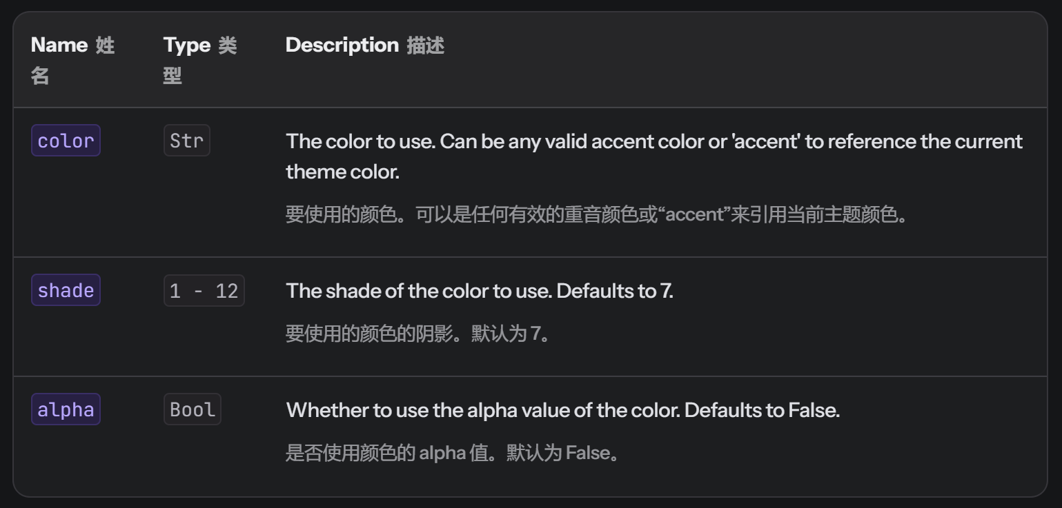
Shades 阴影
Sometime you may want to use a specific shade of a color from the theme. This is recommended vs using a hex color directly as it will automatically change when the theme changes appearance change from light/dark.
To access a specific shade of color from the theme, you can use the rx.color. When switching to light and dark themes, the color will automatically change. Shades can be accessed by using the color name and the shade number. The shade number ranges from 1 to 12. Additionally, they can have their alpha value set by using the True parameter it defaults to False. A full list of colors can be found here.
rx.flex(
    rx.button(
        "Hello World",
        color=rx.color("grass", 1),
        background_color=rx.color("grass", 7),
        border_color=f"1px solid {rx.color('grass', 1)}",
    ),
    spacing="2",
)
Regular Colors 常规颜色
您也可以使用标准的十六进制、RGB 和 RGBA 颜色。
rx.flex(
    rx.button(
        "Hello World",
        color="white",
        background_color="#87CEFA",
        border="1px solid rgb(176,196,222)",
    ),
    spacing="2",
)
Toggle Appearance 切换外观
手动切换浅色和深色模式,您可以使用 event trigger toggle_color_mode
from reflex.style import toggle_color_mode


def index():
    return rx.button(
        "Toggle Color Mode",
        on_click=toggle_color_mode,
    )
Appearance Conditional Rendering 外观条件渲染
使用 rx.color_mode_cond component 来渲染不同模式(light or dark mode)下组件的不同样式
rx.color_mode_cond(
    light=rx.image(
        src="/logos/light/reflex.svg",
        alt="Reflex Logo light",
        height="4em",
    ),
    dark=rx.image(
        src="/logos/dark/reflex.svg",
        alt="Reflex Logo dark",
        height="4em",
    ),
)
This can also be applied to props.
rx.button(
    "Hello World",
    color=rx.color_mode_cond(light="black", dark="white"),
    background_color=rx.color_mode_cond(
        light="white", dark="black"
    ),
)
Responsive 响应式
| Size | Width |
|---|---|
initial | 0px |
xs | 30em |
sm | 48em |
md | 62em |
lg | 80em |
xl | 96em |
Reflex apps can be made responsive to look good on mobile, tablet, and desktop.
You can pass a list of values to any style property to specify its value on different screen sizes.
rx.text(
    "Hello World",
    color=["orange", "red", "purple", "blue", "green"],
)
# The text will change color based on your screen size. If you are on desktop, try changing the size of your browser window to see the color change.
响应式值也可以使用 rx.breakpoints 来指定。每个尺寸都映射到一个相应的键,当屏幕尺寸大于或等于命名的断点时,将应用该键的值。
rx.text(
    "Hello World",
    color=rx.breakpoints(
        initial="orange",
        sm="purple",
        lg="green",
    ),
)
在 CSS 单位中,可以使用�字典将自定义断点映射到每个组件的值,而不是使用命名参数。
rx.text(
    "Hello World",
    color=rx.breakpoints(
        {
            "0px": "orange",
            "48em": "purple",
            "80em": "green",
        }
    ),
)
Showing Components Based on Display
A common use case for responsive is to show different components based on the screen size.
Reflex 为此提供了有用的辅助组件。
rx.vstack(
    rx.desktop_only(
        rx.text("Desktop View"),
    ),
    rx.tablet_only(
        rx.text("Tablet View"),
    ),
    rx.mobile_only(
        rx.text("Mobile View"),
    ),
    rx.mobile_and_tablet(
        rx.text("Visible on Mobile and Tablet"),
    ),
    rx.tablet_and_desktop(
        rx.text("Visible on Desktop and Tablet"),
    ),
)
您可以通过使用 display 样式属性来指定响应式组件使用的断点。
rx.vstack(
    rx.text(
        "Hello World",
        color="green",
        display=["none", "none", "none", "none", "flex"],
    ),
    rx.text(
        "Hello World",
        color="blue",
        display=["none", "none", "none", "flex", "flex"],
    ),
    rx.text(
        "Hello World",
        color="red",
        display=["none", "none", "flex", "flex", "flex"],
    ),
    rx.text(
        "Hello World",
        color="orange",
        display=["none", "flex", "flex", "flex", "flex"],
    ),
    rx.text(
        "Hello World",
        color="yellow",
        display=["flex", "flex", "flex", "flex", "flex"],
    ),
)
Custom Stylesheets 自定义样式表
Reflex 允许您添加自定义样式表。只需将样式表的 URL 传递给 rx.App :
app = rx.App(
    stylesheets=[
        "https://cdnjs.cloudflare.com/ajax/libs/animate.css/4.1.1/animate.min.css",
    ],
)
您还可以添加本地样式表。只需将样式表放在 assets/ 下,并将样式表的路径传递给 rx.App :
app = rx.App(
    stylesheets=[
        "/styles.css",  # This path is relative to assets/
    ],
)
Fonts
您可以利用 Reflex 对自定义样式表的支持,将自定义字体添加到您的应用程序中。
app = rx.App(
    stylesheets=[
        "https://fonts.googleapis.com/css2?family=IBM+Plex+Mono:ital,wght@0,100;0,200;0,300;0,400;0,500;0,600;0,700;1,100;1,200;1,300;1,400;1,500;1,600;1,700&display=swap",
    ],
)
然后,您可以通过设置 font_family 属性在您的组件中使用该字体。
rx.text(
    "Check out my font",
    font_family="IBM Plex Mono",
    font_size="1.5em",
)
Local Fonts
By making use of the two previous points, we can also make a stylesheet that allow you to use a font hosted on your server.
如果您的字体叫做 MyFont.otf ,请将其复制到 assets/fonts 。
让我们创建样式表 myfont.css 。
@font-face {
    font-family: MyFont;
    src: url("/fonts/MyFont.otf") format("opentype");
}

@font-face {
    font-family: MyFont;
    font-weight: bold;
    src: url("/fonts/MyFont.otf") format("opentype");
}
app = rx.App(
    stylesheets=[
        "/fonts/myfont.css",  # This path is relative to assets/
    ],
)
⭐ Layout Components 布局组件
布局组件,如 rx.flex , rx.container , rx.box 等,用于组织和结构化应用程序的视觉呈现
Box
rx.box 可以为其子元素应用任何 CSS 样式。它是一个可用于应用特定布局或样式属性的构建块。
By default, the Box component is based on the div and rendered as a block element. It's primary use is for applying styles.
When to use: Use
rx.boxwhen you need to apply specific styles or constraints to a part of your interface.
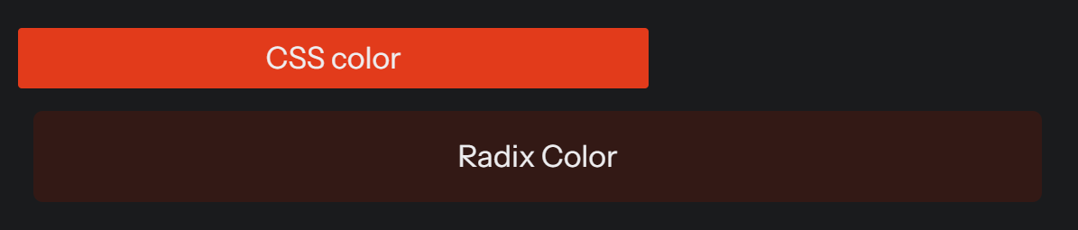
rx.box(
    rx.box(
        "CSS color",
        background_color="red",
        border_radius="2px",
        width="50%",
        margin="4px",
        padding="4px",
    ),
    rx.box(
        "Radix Color",
        background_color=rx.color("tomato", 3),
        border_radius="5px",
        width="80%",
        margin="12px",
        padding="12px",
    ),
    text_align="center",
    width="100%",
)
Stack
rx.stack is a layout component that arranges its children in a single column or row, depending on the direction (flex_direction). 对于保持元素间一致间距很有用。
这些组件基于 flex 组件,因此继承了它的所有属性。
When to use: Use
rx.stackwhen you need to lay out a series of components either vertically or horizontally with equal spacing.
rx.flex(
    rx.stack(
        rx.box(
            "Example",
            bg="orange",
            border_radius="3px",
            width="20%",
        ),
        rx.box(
            "Example",
            bg="lightblue",
            border_radius="3px",
            width="30%",
        ),
        flex_direction="row",
        width="100%",
    ),
    rx.stack(
        rx.box(
            "Example",
            bg="orange",
            border_radius="3px",
            width="20%",
        ),
        rx.box(
            "Example",
            bg="lightblue",
            border_radius="3px",
            width="30%",
        ),
        flex_direction="column",
        width="100%",
    ),
    width="100%",
)
Flex
The rx.flex component is used to create a flexible box layout, inspired by CSS Flexbox. 它非常适合设计一个布局,其中项目的大小可以根据可用空间动态增长和收缩。
When to use: Use
rx.flexwhen you need a responsive layout that adjusts the size and position of child components dynamically.
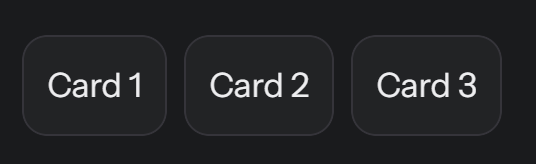
rx.flex(
    rx.card("Card 1"),
    rx.card("Card 2"),
    rx.card("Card 3"),
    spacing="2",
    width="100%",
)
Center
Center 是一个将其子元素居中显示的组件。它基于 flex 组件,因此继承了其所有属性。
rx.center(
    rx.text("Hello World!"),
    border_radius="15px",
    border_width="thick",
    width="50%",
)

Grid
rx.grid components are used to create complex responsive layouts based on a grid system, similar to CSS Grid Layout.
When to use: Use
rx.gridwhen dealing with complex layouts that require rows and columns, especially when alignment and spacing among multiple axes are needed.
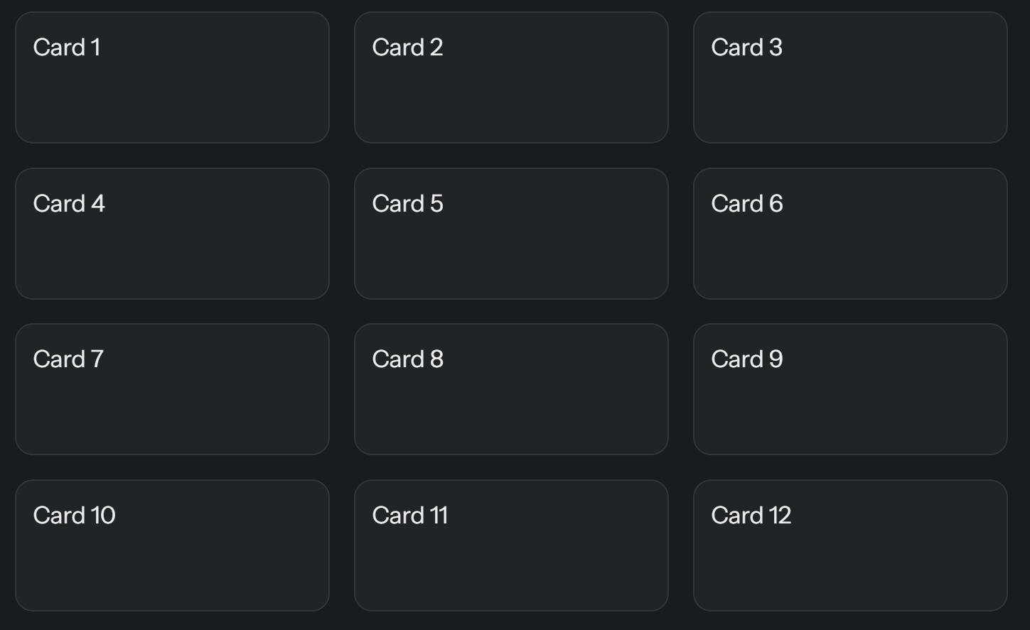
rx.grid(
    rx.foreach(
        rx.Var.range(12),
        lambda i: rx.card(f"Card {i + 1}", height="10vh"),
    ),
    columns="3",
    spacing="4",
    width="100%",
)
Container
rx.container 限制页面内容的最大宽度,同时保持响应式布局的灵活边距(通常用于包裹页面的主要内容或 center content on large screens)
When to use: Use
rx.containerfor wrapping your application’s content in a centered block with some padding.
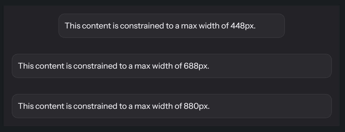
rx.box(
    rx.container(
        rx.card(
            "This content is constrained to a max width of 448px.",
            width="100%",
        ),
        size="1",
    ),
    rx.container(
        rx.card(
            "This content is constrained to a max width of 688px.",
            width="100%",
        ),
        size="2",
    ),
    rx.container(
        rx.card(
            "This content is constrained to a max width of 880px.",
            width="100%",
        ),
        size="3",
    ),
    background_color="var(--gray-3)",
    width="100%",
)